Doing Data Science Locally
Written on March 24th, 2021 by Christopher Kinson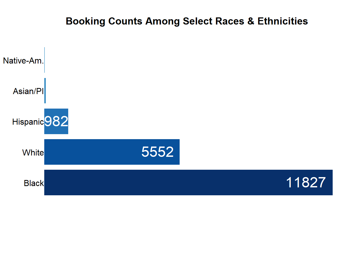
Because I enjoy working with data and thinking about how it is used, I make time to play with real data. So why not play with real data that is related to where I live and work? Cities and locales across the country have been making data publicly available as a part of civic responsibility and transparency. Urbana, Champaign, and the state of Illinois each offer publicly available data that have attracted few eyes, especially those with a background in data science and statistics. Let’s change that today!
Champaign County Sheriff’s Office and Jail Data
The dataset contains individuals who were booked into the Champaign County Jail between the years 2012-2018. The individuals are not identifiable based on personal identity, but they are given other identifiers such as jacket numbers and booking IDs. The demographics of the people, reasons for being booked, and crime code are also given in the data. The original source is the Champaign County Sheriff Office & Jail (CCSO) https://data.illinois.gov/dataset/jail-booking-data.
Here’s an example of crafting better data visualizations with this data using base R (not the tidyverse). See N. Yau’s Data Points, C. Knaflic’s Storytelling with Data, and E. Tufte’s The Visual Display of Quantitative Information for more ideas.
Not Good

Better

I also want to highlight data visualizations as opportunities for asking questions. For this data, I might want to know what circumstances are leading to the bookings for the ethnic and racial groups? How long are certain groups spending in jail? When people do get out of jail, what was the means for their release? Is there an association with the reasons people are booked into jail and the reasons for their release?
Beyond examples of data visualizations for graphical design and exploration, I also investigate (problem-posing, planning, data wrangling, analyzing, concluding) it. See C.J. Wild and M. Pfannkuch’s PPDAC Investigative Cycle for more information.
For example, the cities in this dataset are mostly in east central Illinois.
| City | Frequency |
|---|---|
| CHAMPAIGN | 6006 |
| URBANA | 3772 |
| RANTOUL | 1521 |
| MAHOMET | 422 |
| DANVILLE | 311 |
| CHICAGO | 283 |
| TOLONO | 189 |
| SAVOY | 152 |
| THOMASBORO | 132 |
| CHAMAPIGN | 120 |
| FISHER | 73 |
| ST JOSEPH | 69 |
| DECATUR | 59 |
| SADORUS | 56 |
| BLOOMINGTON | 55 |
| INDIANAPOLIS | 52 |
| SIDNEY | 50 |
| PEORIA | 45 |
| HOMER | 42 |
| SPRINGFIELD | 42 |
But I can see some misspelled city names in this table. Here’s a closer look at the spellings of Champaign and Urbana.
| City | Frequency |
|---|---|
| CHAAMPAIGN | 4 |
| CHAMAIGN | 5 |
| CHAMAPAIGN | 6 |
| CHAMAPIAGN | 2 |
| CHAMAPIGN | 120 |
| CHAMPAGIN | 9 |
| CHAMPAIGIN | 2 |
| CHAMPAIGN | 6006 |
| CHAMPAIGN, | 3 |
| CHAMPAIN | 2 |
| CHAMPAING | 4 |
| CHAMPAITGN | 3 |
| CHAMPIAGN | 2 |
| URANA | 3 |
| URBANA | 3772 |
| URBNANA | 4 |
| UURBANA | 2 |
Which makes me wonder, how is the information being collected? Are the people being booked into jail filling out a form? Or are the cities being written or typed by a member of the Sheriff’s Office? Either way, a major recommendation for this dataset and those who manage it is to standardize the input of the cities in which people reside. A simple drop-down menu containing the names of all cities and villages in Illinois is quick to implement. An alternative is to have a drop-down menu for only the most common cities and leave the remaining cities as text entry.
Now for a more serious topic: jail and COVID-19. As the pandemic progresses and cases and deaths continue to rise throughout the state of Illinois, I am concerned about people sitting in jail cells and confined common areas who may be severely exposed to novel coronavirus.
If I consider only people booked into jail beginning in 2020, I might ask the following… How long are they there before being released? What is the population per day in general and among the different racial and ethnic groups? How does the current jail population compare to last year’s?

One thing to notice from this visualization is that the number of people remaining in jail as time progresses is trending upwards regardless of race/ethnicity. I would hope that the trend would be decreasing, but it’s not. What might be causing this trend? Obviously, the people remaining in jail either have later release dates than July 31, 2020 or no release dates at all. Is the population remaining in jail due to severity of crime or some other underlying cause?
On December 23, 2020, this happened: 30% of Danville Correctional Center’s inmates are currently battling COVID-19.
Urbana Rental Inspections Data
The dataset contains rental properties throughout Urbana that have been inspected and given a letter grade by city inspectors since the year 2007. The better the grade, the less code violations a property may have. Additional information about the city of Urbana’s Rental Registration and Inspection Program can be found at https://www.urbanaillinois.us/RRP. The original source is the City of Urbana https://data.urbanaillinois.us/Buildings/Rental-Inspection-Grades-Listing/tn7v-fm2b/data.
A question I might have for this data is: do rental properties closer to campus tend to have higher grades? My thought is that Urbana-Champaign is a college town (or towns if considered separately). The bulk of dollars spent might come from students given their large enrollment (typically speaking) of 40,000 or so. Thus, any business or landlord should do their best to please students by offering superior housing.
Here’s a map of the rentals for this dataset.

I’ll define “closer to campus” as within a 1 mile radius of the Illini Union, which is located at 1401 W Green St, Urbana, IL 61801 or (40.109399, -88.227244). I’ll use the haversine distance metric to determine how far the rentals are from the Illini Union. Any rentals within 1 mile will be identified by a blue symbol, while the Illini Union will be identified with a orange symbol. With the two groups of rentals (closer to campus vs not closer to campus), I’ll compute basic statistics about the grades in order to find tendency toward higher grades.
A new map and table might look like this.

| closer2campus | Grade | freq | pct |
|---|---|---|---|
| 0 | Class A | 120 | 10.8205591 |
| 0 | Class B | 921 | 83.0477908 |
| 0 | Class C | 63 | 5.6807935 |
| 0 | Class D | 3 | 0.2705140 |
| 0 | Class F | 2 | 0.1803427 |
| 1 | Class A | 39 | 6.0000000 |
| 1 | Class B | 545 | 83.8461538 |
| 1 | Class C | 65 | 10.0000000 |
| 1 | Class N | 1 | 0.1538462 |
| NA | Class B | 1 | 100.0000000 |
Roughly, 94% of the rental units that are not closer to campus scored an inspection grade of B or higher, while only about 90% of units that are closer to campus scored an inspection grade of B or higher. The key difference between the closer to campus and not are the highest scored units. The number of A grade rental units in the not closer to campus group is almost twice that of the closer to campus group.
So are students compromising the quality of their living spaces? Are landlords the problem? Or maybe a bit more straightforward, are students even aware of the inspection grade for their potential rentals? It’s likely that I need more information about these properties such as rent costs, layout, pet-friendliness, etc. And more information about the students, SES, income, family income, international or domestic, from Illinois or not, survey of the importance of living quality, etc. Time will tell when I can answer these questions and hopefully ask more…
2020 Election Vote By Mail Data
The 2020 election - much like everything else that happened this year - was like no other. The COVID-19 pandemic spurred creative and preventative measures of casting ballots and voting early and without physically showing up to the polls. Thanks to the Office of the Champaign County Clerk, we are able to access data about the process of voting by mail. This data included individual information and dates for when the ballot was requested by individual, sent by clerk’s office, and received by clerk’s office. One of my concerns with the data was that my wife never received her ballot in the mail even though the data says that it was sent by the clerk’s office. I wondered: how many ballots had been requested but not received by the clerk’s office?

According to the data, there were 7140 vote-by-mail ballots unaccounted for by November 2, 2020. I use the phrase “unaccounted for”, because there is no received date for these individuals in the data, yet these same individuals had requested the vote-by-mail ballot. As we all saw, the election results have been contested several times and even some states re-counted their ballots with results unchanged. Regardless of the results, I think we need better tracking and security for the vote-by-mail process. We should also demand more accountability from our mail carriers, government employees, and public officials when people’s ballots disappear. Mail carriers have had a tremendous amount of pressure placed upon them during this pandemic and I certainly hope they are being supported and cared for as essential workers.